
Project Firefly

Project Firefly began as a redesign of Achieve’s Goal-Setting and Reflection Surveys (GRSs). With guidance from product managers Noel and Katie, the idea evolved into a prototype that blends GRSs with Pulse Surveys, reimagining how students engage with reflection, goal-setting, and progress tracking.
Case Study Summary
🫡 My Role
UX/UI Designer, UX Researcher
⏰ Timeline
2 months
Continuous Iteration
🧑🤝🧑 Team
1 UX/UI Designer/Researcher, 2 Product Managers, 1 Developer
📝 Methods
Primary research, Secondary research, Affinity mapping, Personas, Site evaluation, Competitive analysis, Comparative analysis, Problem identification, Solutions design
Table of Contents
1
Research
2
Design
3
Final Design
4
Reflection
01 Research
Goal-Setting & Reflection Surveys (GRSs): GRSs are structured surveys in Achieve that prompt students to set academic or personal goals at the start of a course and reflect on their progress over time. They encourage a growth mindset and help learners connect classroom activities to long-term outcomes. While they provide valuable insights for instructors, students often view them as long, repetitive, or disconnected from their day-to-day learning. Also, the GRS button is hard to distinguish on the homepage.
Pulse Surveys: Pulse Surveys are quick, check-in style surveys designed to capture real-time student feedback during the term. They allow instructors to gauge student experiences, identify challenges, and adapt instruction accordingly. Unlike GRSs, Pulse Surveys are shorter and more flexible, but students sometimes perceive them as routine tasks rather than meaningful opportunities for reflection.
Website Overview


Affinity Map Insights: Fall 2024 Research
In talking to my product managers, Noel and Katie, I was able to view past user research conducted on both GRSs and Pulse Surveys. Three themes emerged from conducting an affinity mapping using the research data:
Instructor Support & Engagement Structure
Students wanted recognition and rewards from professors that made surveys feel purposeful, not just another assignment.Content Format & Cognitive Load
Surveys were too long and mentally draining. Students preferred shorter, more visual, and interactive formats.Goal-Setting & Depth of Reflection
Students found prompts surface-level and wanted deeper, more relevant reflection tied to real-life goals.
Using the Fall 2024 Research, two personas came to life to capture different student mindsets:
Gregory – an overwhelmed undergrad who views surveys as tasks but will engage if they feel meaningful and connected to his goals.
Gloria – a reflective grad student who values growth but wants deeper, more relevant prompts tied to her personal experiences.
Personas


In comparing Achieve’s GRSs to similar platforms in the market, the following information was found:
Strengths of Achieve’s GRSs:
Pre- and post-assessments
Personalized goals & growth mindset prompts
SMART goals and progress charts
Gaps Identified:
Lack of voice/video reflection options
No survey-linked progress tracker
No rewards or gamified motivation system
Competitive Analysis

In comparing Achieve’s GRSs to platforms focused on goal-setting in different areas, the following information was found:
Strengths of Achieve’s GRSs:
SMART goals
Progress chart for instructors
Motivational content
Customizable goals
Intuitive user interface
Gaps Identified:
Start/end dates for goals
Daily/weekly check-ins
Habit tracking interface
Gamification elements
Behavior-based suggestions
Journaling logs
Guided goal-setting routines
Comparative Analysis

After synthesizing all data, it was clear that the major problem was there is low student engagement/wanting to engage with Achieve’s Goal-Setting and Reflection Surveys (GRSs). Understanding this and all the information found in the research phase, 4 use cases were created in order to find solutions to specific issues:
As a student, I want non-academic surveys to be visually engaging and interactive, so I can be motivated to complete them.
As a student, I want the survey experience to feel personalized so I can better understand my progress toward achieving my course goals.
As a student, I want to be able to reflect on my answers in order to provide genuine responses.
As a student, I want an indicator that shows me that non-academic assignments have a different purpose to regular assignments so that I can understand the importance.
Problem/Solution
02 Design
Onboarding Flow Sketches:
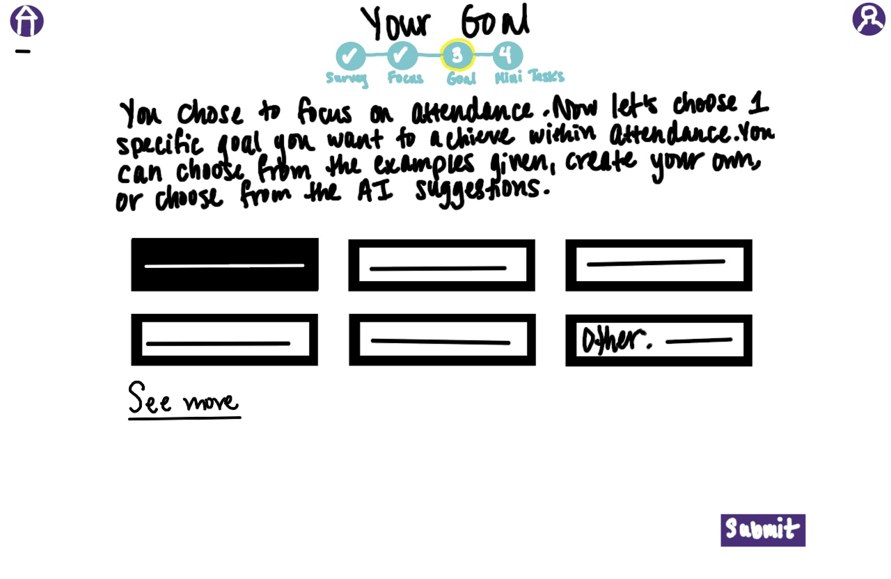
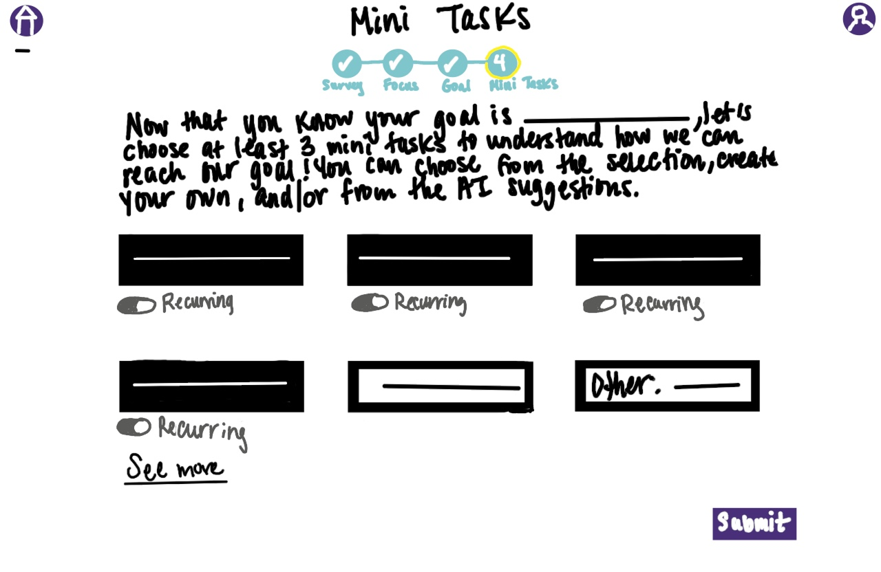
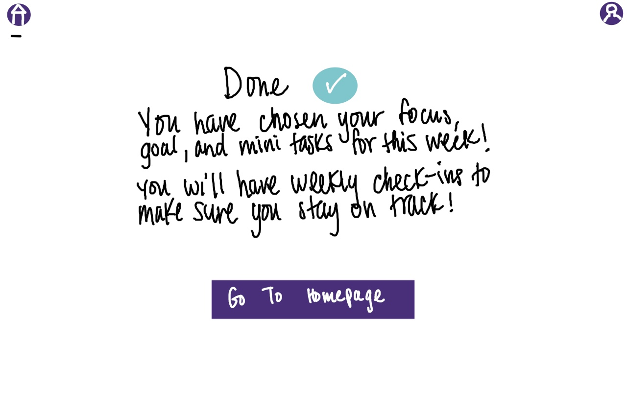
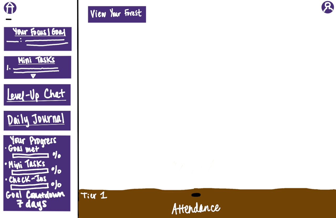
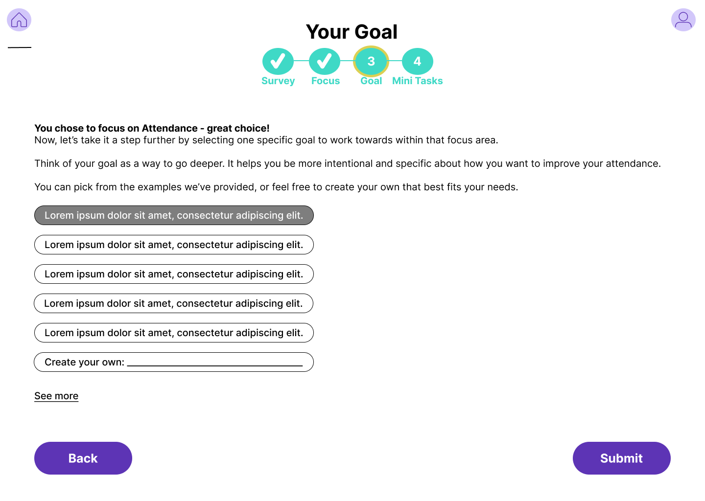
The onboarding flow was designed to guide students step by step into a personalized and engaging experience. After clicking the “Non-Academics” button on the Achieve homepage, they are welcomed with a clear overview of the four-step process and time estimate. From there, students complete an 8-question survey that tailors their account to their needs, then select a Tier 1 focus area to work on for the week. They choose a specific goal, either from suggestions or their own creation, and break it down into at least three mini tasks, with the option to set recurring actions. Once confirmed, students land on their homepage, where their full weekly plan is displayed alongside tools like check-ins, journaling, and a progress tracker. At the heart of the design is a motivational visual: a seed that grows into a tree as tasks are completed, eventually forming a forest that represents progress and growth throughout the semester.
Sketches

Step 1

Step 2

Step 3

Step 4
Step 5
Step 6
Step 7
Step 8
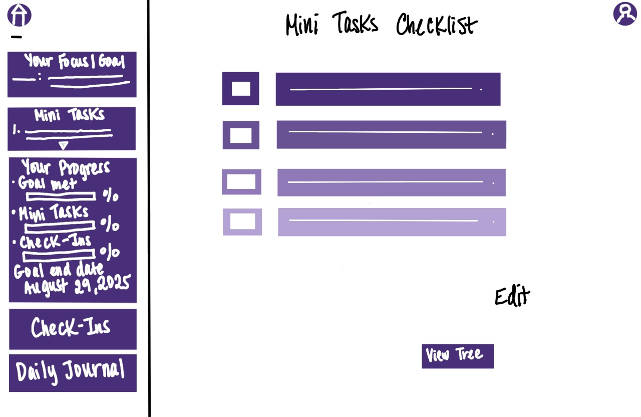
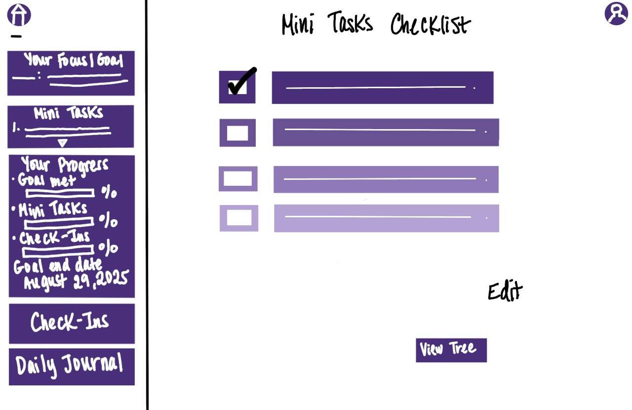
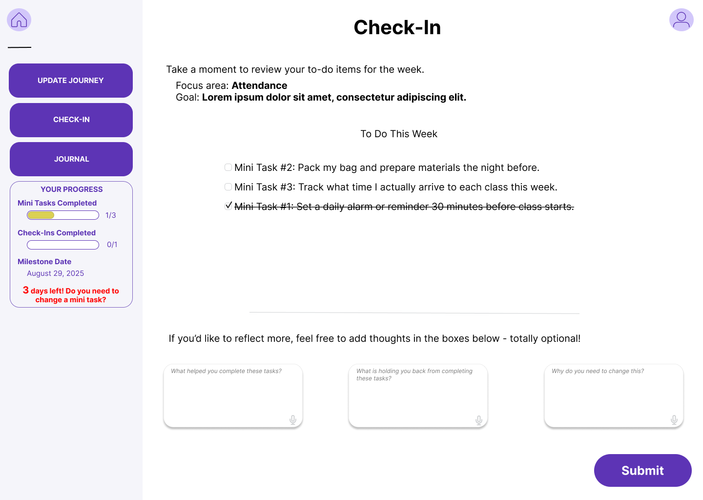
Mini Task Completion Flow Sketches:
The mini task completion flow guides students from their homepage to a checklist of weekly tasks, where each completed task prompts reflection and a visual update of their progress. As tasks are checked off, the student’s progress bar advances and their tree grows, providing a satisfying, tangible representation of achievement that keeps them motivated throughout the week.
Step 1

Step 2
Step 3

Step 4
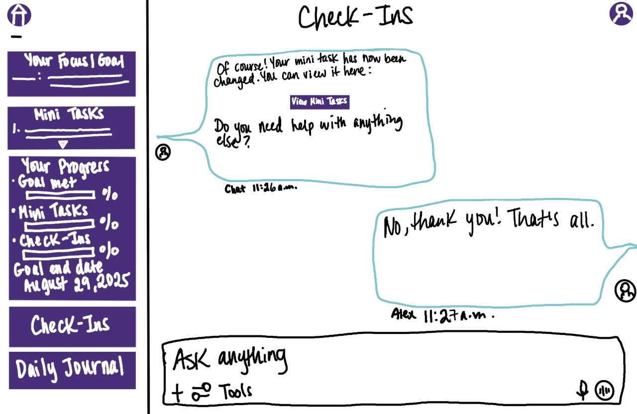
Weekly Check-In Flow Sketches:
The weekly check-in flow uses a guided chat to help students reflect, adjust, and update their mini tasks, creating a personalized sense of progress. From viewing their tree and focus area stickers to selecting and updating specific tasks, students can see their changes reflected instantly on the homepage through updated sidebars and filled-in stickers. This process reinforces growth with a motivating feedback loop: reflect, adjust, and visually see progress.

Step 1

Step 2

Step 3

Step 4
Step 5

Step 6

Step 7
For the visual design, I chose purple as the primary color—not out of preference, but for its psychological impact. Drawing from my teaching experience, I knew color influences emotion and engagement, and purple communicates curiosity, mystery, and motivation, key to re-engaging students with Achieve’s GRSs. Using tools like Google and Coolors, I built a modern, cohesive palette with secondary and accent colors that support this intentional emotional tone.
Colors
Primary
Secondary
Accent #2
Background #1
Background #2
Accent #1
Once there was a clear design direction established, usability test was conducted with 10 college students, combining qualitative and quantitative feedback. The goal was to evaluate layout clarity, feature preferences, and overall first impressions. Key findings included:
6 participants preferred checklist-style check-ins.
6 participants wanted clearer connections between focus areas, goals, and mini tasks.
5 participants requested a more transparent onboarding preview with clearer guidance.
6 participants suggested gamifying the homepage with custom items like animals or fruits.
6 participants emphasized the importance of a stress-free, non-graded experience.
These insights provided clear opportunities to refine the prototype for greater clarity, personalization, and engagement.
Usability Test #1
Based on usability feedback, the mid-fidelity prototype was iterated to improve clarity, personalization, and motivation.
Mid-Fi Prototype

The onboarding homepage was updated with clear explanations of each step, helping students understand the process before beginning.


The tier system was refined with short descriptions, and the connections between focus areas, goals, and mini tasks were clarified to make the progression more intuitive.

To increase engagement, a customization bank was introduced, allowing students to add fun, rewarding elements to their homepage.
The weekly check-in was redesigned into a checklist format, and flexibility was added for updating milestone dates, creating a more supportive, stress-free experience.

To keep the tone light and supportive, an option for students to update their milestone date was added.
After finalizing the mid-fidelity prototype, collaboration with the development team explored potential gamification features. Feasible options included animated progress bars, real-time tree growth with watering interactions, and engaging call-to-action buttons. Features outside the current development scope, such as drag-and-drop customization, were reimagined: customization elements were incorporated into preset spots on the homepage to maintain user engagement while staying within technical constraints.
Developer Meeting Notes
A second usability test was conducted with 10 students reviewing the mid-fidelity prototype. Key focus areas included onboarding clarity, the connection between Focus Areas, Goals, and Mini Tasks, mini task setup, expectations for the “Update Journey” feature, checklist usability, and reactions to check-ins, visual progress, and homepage customization.
Key Findings:
4 participants wanted clarity that the tool supports learning and behavioral tracking, not subject-based tracking.
6 participants needed a clear visual of the full journey rather than placeholder text.
3 participants suggested adding small celebratory visuals for motivation.
Most participants responded positively to the “Update Journey” button, with 3 participants recommending a name adjustment to “Update Your Journey.”
4 participants requested visual demos or animations to enhance engagement and motivation.
These insights helped validate and refine key design decisions, ensuring the prototype better supports user understanding, engagement, and motivation.
Usability Test #2
During design critique, feedback highlighted that some navigation buttons resembled call-to-action buttons, potentially causing user confusion. Button styling was adjusted to improve clarity and ensure a more intuitive navigation experience.
Weekly Critique Feedback

Feedback also suggested making reflection questions more intentional and directly tied to specific mini tasks. Questions were positioned beneath their related tasks to improve clarity and relevance, enhancing the overall user experience.

Based on the second usability feedback, the high-fidelity prototype was iterated to improve clarity, usability, and engagement.
Hi-Fi Prototype

A clear homepage label was added to help students immediately understand the experience.

Onboarding steps were streamlined, with dotted lines visually connecting each step, from survey to focus area, goal, and mini tasks.


Placeholder text was replaced with real, intentional content to make the experience more meaningful.


Early animation concepts were introduced to increase engagement and provide visual feedback.

Navigation was simplified for clarity, and the “Update Journey” button was renamed to “Update Your Journey.”

Questions were made more task-specific and positioned directly beneath each completed mini task to improve relevance and user understanding.
Following prototype refinement, feedback recommended limiting mini task check-offs to the Check-In feature only, rather than duplicating the option in the “Update Your Journey” section. To align with this change, the sidebar metric was updated from “Check-Ins Completed” to “Questions Completed,” ensuring consistency and clearer tracking for users.
Product Manager Feedback
03 Final Design
04 Reflection
With the high-fidelity prototype completed, several opportunities remain for further exploration:
Conduct another round of usability testing with real content in place, including feedback on the updated “Update Your Journey” button label.
Fully design the “View Your Journey” feature to support student reflection on weekly growth.
Build out the Journal page to deepen student connection and long-term engagement.
These next steps would extend the prototype’s impact by strengthening reflection, motivation, and overall user engagement.