

Piper Republic
Piper Republic was a three-week project where my team and I collaborated closely with CEO and Founder Beth Cochran. Through weekly meetings, we worked together to redesign the existing website with a focus on creating an intuitive, clear, and efficient user navigation experience.
Case Study Summary
🫡 My Role
UX Researcher
⏰ Timeline
3 weeks
Continuous Iteration
🧑🤝🧑 Team
1 UX/UI Designer, 1 UX Researcher, 1 Project Lead, 1 Data and Analytics Lead
📝 Methods
Primary research, Secondary research, Affinity mapping, Competitive analysis, Problem identification, Solutions design
Process
1
Research
2
Design
3
Final Design
4
Reflection
01 Research
In this program, our focus as UX designers is to create meaningful impact through thoughtful design. This philosophy aligns with Piper Republic’s commitment to fostering sustainability within the architecture and design community. Led by Beth, the company emphasizes eco-conscious practices, acknowledging the environmental challenges posed by architecture—one of the highest contributors to carbon emissions and resource depletion.
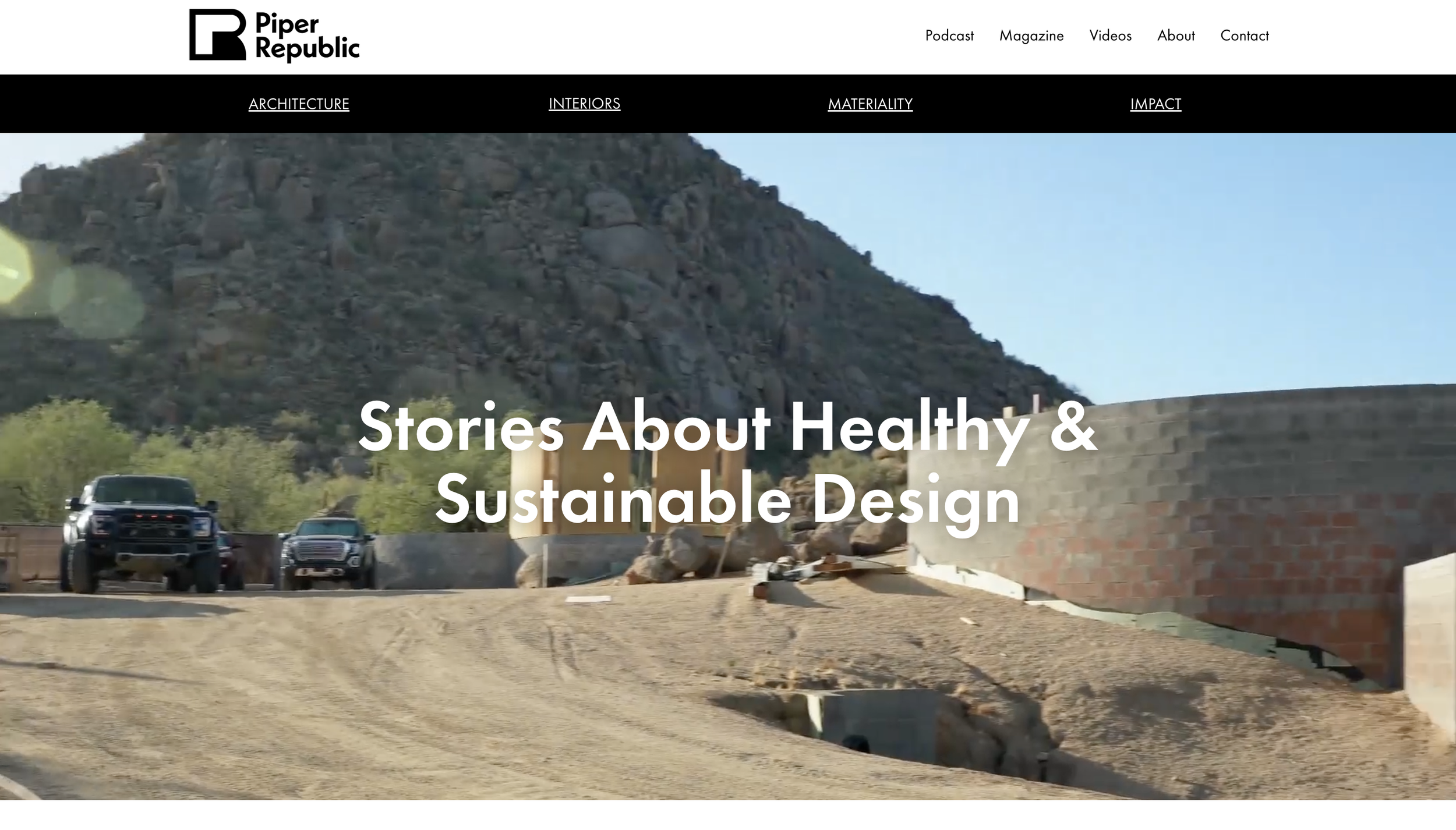
Piper Republic is a multimedia company dedicated to inspiring the design and architecture community with resources that advocate for healthy, regenerative design. Through meticulously crafted articles, engaging videos, and a thought-provoking podcast, Piper Republic offers invaluable tools and insights for professionals dedicated to creating sustainable, wellness-centered spaces.
Website Overview
According to UCLA’s Sustainability Committee, sustainability is “the integration of environmental health, social equity, and economic vitality to create thriving, healthy, diverse, and resilient communities for this generation and generations to come.” Piper Republic supports this mission by promoting the use of LEED-certified (Leadership in Energy & Environmental Design) projects, which lower electricity costs, reduce carbon emissions, and create healthier environments. Additionally, they advocate for sustainable materials to support ecological balance.
Secondary Research
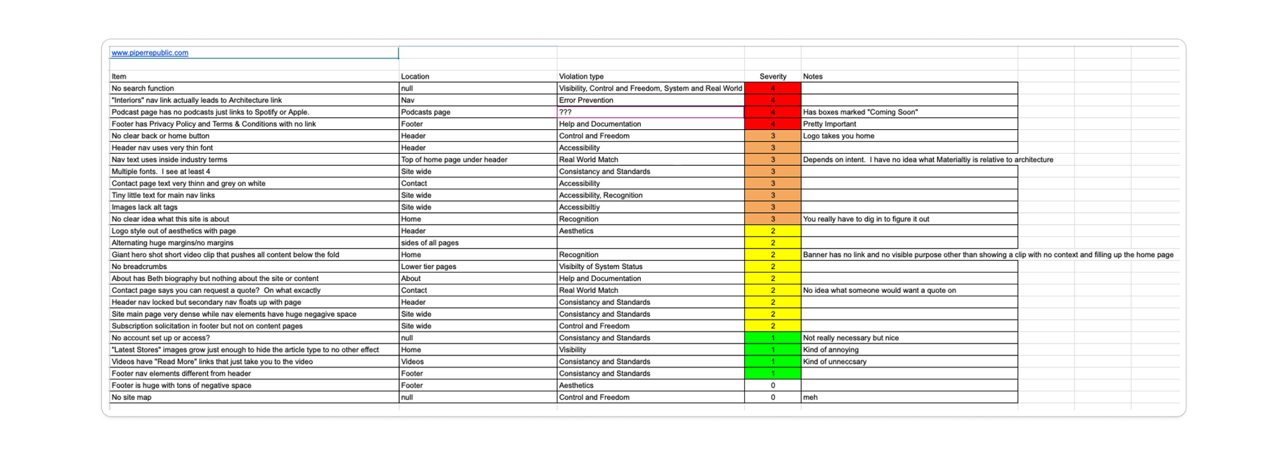
Heuristics Evaluation
Our initial heuristic evaluation of the website revealed key areas for improvement:
Navigation Challenges
Two navigation bars and distinct footers created a confusing user experience.
Content Accessibility
The lack of a search function hindered content discoverability.
Visual Clarity
Images lacked alt tags, making them inaccessible for users with visual impairments.
Page Specifics
The article overview page lacked filters, categories, and sorting options, while excessive text and cluttered titles made it challenging to navigate.
This evaluation prompted us to ask:
How might we create a clear, intuitive user journey that aligns with Piper Republic’s mission?
How can we organize information to be comprehensive without overwhelming users?
To understand essential industry features, we conducted a competitive analysis, comparing Piper Republic’s website to those of Architectural Digest, Inhabitat, Metropolis, and Interior Design.
Competitive Analysis

Key Insights
Simplifying navigation to a single set of tabs.
Adding a search function and filtering options to enhance content accessibility and organization.
We were able to interview 10 users. 9 of those users were in the design field and 1 of them was not.
User interviews yielded valuable insights:
Sustainability Aesthetics: Users felt that a minimalistic design would align with Piper Republic’s sustainability focus.
Visual Design for Credibility: Users noted that clean, professional visuals would enhance the site’s credibility.
User Interviews
We organized user feedback through affinity mapping, which highlighted three recurring themes:
Affinity Map
Content and Information
Users valued a clear brand message, engaging visual elements, and concise information. They preferred avoiding lengthy sign-up forms and wanted visual media to support written content.
Design Aesthetics
A minimalist, clean layout with neutral, natural-inspired colors resonated with users, as it aligns with sustainability principles and enhances credibility.
Navigation
Users expressed a strong preference for a search bar, clear category organization, and streamlined navigation.
The insights we gathered from the affinity map informed the creation of 2 primary personas:
1. Joseph: An architect seeking sustainable techniques and inspiration.
2. Dorothy: A doctor building her first home, committed to sustainable practices.
Personas


Based on our research, we formulated the problem statement which intertwines with our solution:
Problem Statement
Users need intuitive, clear, and efficient navigation to quickly locate information and content that aligns with Piper Republic’s mission of sustainable design.
02 Design
We restructured the navigation based on user insights, simplifying it into three primary tabs, which streamlined access to digital content and allowed users to filter media by their preferences. This revised sitemap also included a dedicated space for promoting Piper Republic’s print magazine.
Sitemap

Before:

After:
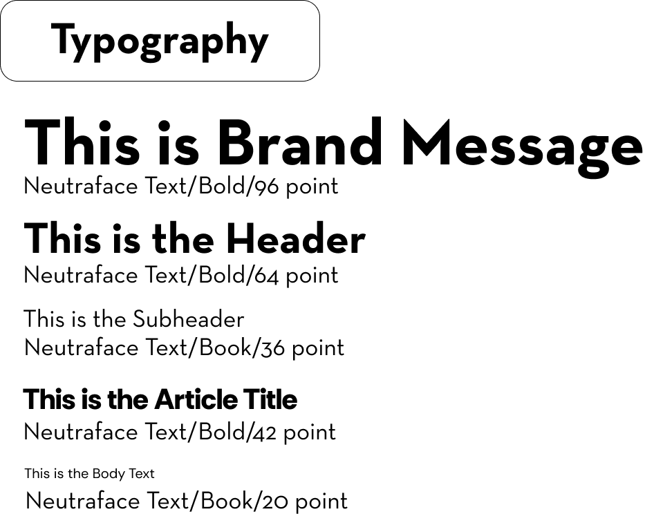
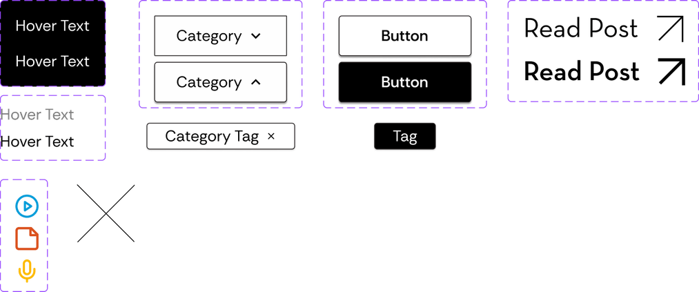
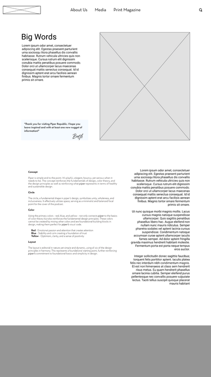
Our style guide and component library was meticulously crafted with a high level of intentionality.
PROJECT GOAL
Reinforce Piper's visual brand identity of Arizona's desert landscape while integrating user feedback for a cohesive, enjoyable, and easy-to-use digital experience.
Ensure brand consistency across the magazine, podcast, and website.
COLOR PALETTE
Primary Colors: Red, Blue Yellow
Purpose: These primary colors align with color theory basics and represent Piper's commitment to design fundamentals. Red - (attention), Blue - (trust), and yellow - (optimism)
Rationale: As the building blocks of color, they cannot be created by mixing, embodying simplicity and clarity in Piper’s visual language.
Layout
Editorial Style: Clean and dynamic, designed to be both aesthetically pleasing and functional.
Design Principles Applied: Incorporates balance, contrast, alignment, proximity, repetition, and hierarchy.
Rationale: A simple, editorial layout supports Piper's foundational approach and enhances usability while maintaining visual appeal.
Style Guide

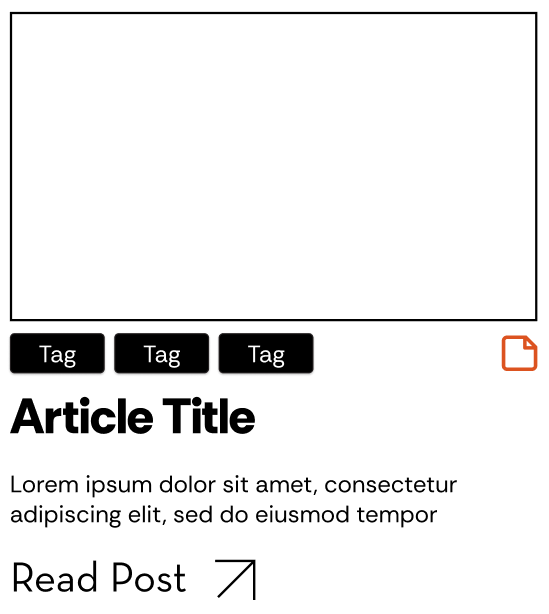
Following our style guide, we developed wireframes that focused on usability and clarity. Key features on the homepage included:
Simplified Navigation: Enhanced accessibility for a more intuitive user experience.
Brand Messaging: A clear, mission-driven message to reinforce the company’s values.
Featured Content: A prominent display of featured work to showcase key projects.
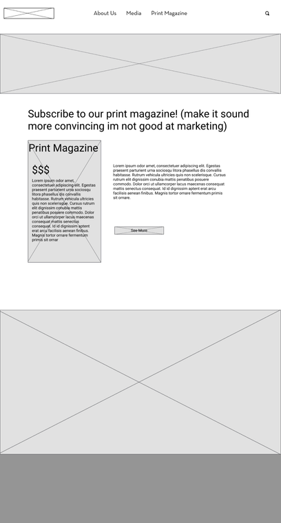
Print Magazine Promotion: Boosted visibility and engagement with strategic magazine placement.
Media Page: Consolidated all media in one location, with filtering options for streamlined navigation.
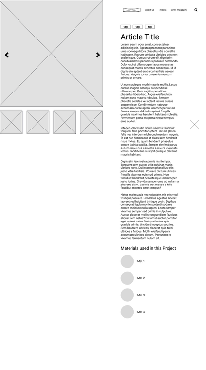
Article Pages: Added details about materials used in each project and a feature for switching between images for an immersive experience.
Wireframes
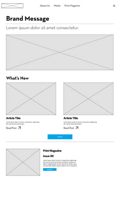
Homepage
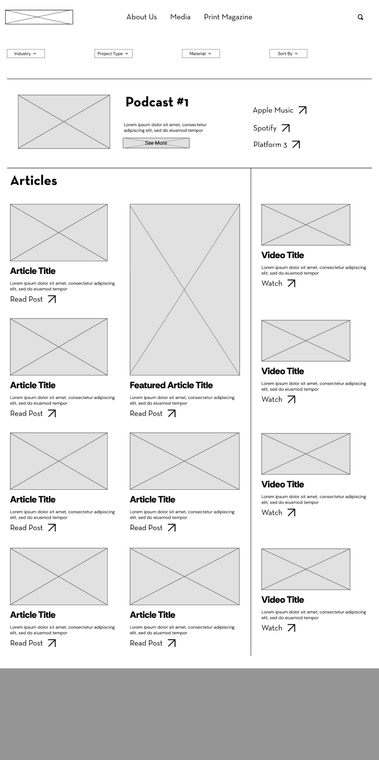
Media Page
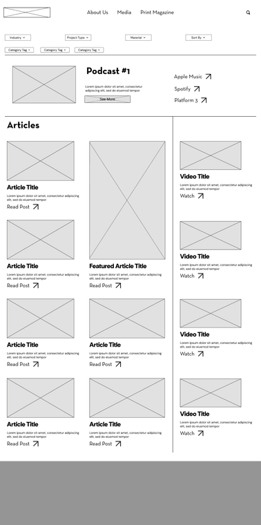
Filtered Media
Article Page
About Us Page
Print Magazine Page
User Testing #1: Lo-Fi Prototype
We conducted initial usability testing with lo-fi wireframes. Key findings included:
Users could find company information easily.
Some struggled with finding and filtering articles.
The layout and navigation received positive feedback.
Users found the "Media" label on the homepage unclear.
Some overlooked the "See More" button for articles.
Filter names on the media overview page were confusing.
Based on this feedback, we refined our prototype and conducted another round of testing. Improvements included:
User Testing #2: Hi-Fi Prototype
A more digestible homepage layout.
Clearer filters and category labels
Increased interest in learning more about the print magazine.
The final wireframes, shaped by our style guide, presented an enhanced user experience:
Homepage: Streamlined navigation, a clear brand message, featured work, and print magazine promotion.
Media Page: Centralized media, with filtering and sorting options to facilitate content discovery.
Article Page: Detailed project information, easy photo toggling, and a clean, readable layout.
Print Magazine Page: Emphasized unique magazine value propositions, access to past issues, and content previews.
About Us Page: Background on both the company and author, reinforcing brand identity.
Podcast Page: Easy access to the latest podcasts and links to other streaming platforms.
Final Wireframes
03 Final Design
04 Reflection
To further enhance Piper Republic's website, we proposed the following next steps:
1. Research: Conduct usability testing on the current site to gather additional insights, and perform comparative research to refine feature requirements.
2. Testing: Execute a third round of usability testing on the updated prototype to validate improvements.
3. Visual Identity: Refine each media tab for a unique design, and optimize the search bar to improve user experience.